Assure's Form Navigation had a Refresh!
At Evotix, we understand the importance of providing modern and easy-to-use health and safety solutions. That’s why we are excited about this latest refresh to form navigation in Assure forms.
The update is live now. Please read on for more details!

Last updated 11 July 2023
Contents

Forms in Assure are becoming easier to use
Last year, we refreshed the Assure UI; but that was just the beginning. Our team has been gathering feedback from customers and we're excited for the next phase of improvements focusing on to the flow of forms.
The refresh will make using Assure forms easier than before - without any changes to the form content itself.
Read on for more details!
Watch this short overview video!
SUPPORTING INFORMATION
➡️ Catch-up with a 30-minute webinar to provide you with an overview of the changes and see those in action
➡️ Access supporting information to prepare you and your teams.
- Documentation with screenshots and examples of the changes to share with your teams.
- A draft email that you can personalise for communicating to your teams.
- A copy of the video to share internally.
WHAT'S CHANGING - THE DETAILS
Improving form navigation in Assure
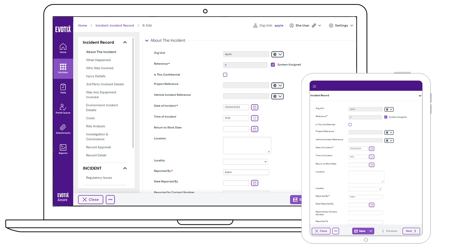
The current tabular bar at the top of the form will be moved to a side menu, making it more intuitive and easier for users to navigate and complete a form.
- The new side navigation bar allows users to work through a form, step-by-step. Form sections can be accessed without scrolling.
- If the form has an iQ questionnaire attached, it will appear as part of the form, including the different sections. After completing the questionnaire, a check box will show the completion status.
- Supporting information, like actions, attachments and notes can be viewed easily from one place.
- Responsive design of the navigation bar allows you to easily navigate forms on different screen sizes, including tablet or mobile.

Updating the bottom bar for a cleaner look
An update to the options available on the bottom bar of the form will make it easier for you to navigate through the workflow. With clear options, you’ll be able to advance the form to the next stage with ease, whether that means submitting the record for approval or completing an investigation.
- Continue to use the multi-function button to change the status of a record (e.g. submitting the form for approval).
- Access to supporting items like actions are being moved to the side navigation.
- New options include:
- ‘Previous’ or ‘Next’ buttons to move through sections of the form
- Expand or collapse all sections of the form with a new three-dot button
- Responsive design allows you to easily select these buttons on different devices.
_1.gif)
Creating one place for all supporting items
Supporting items can now be accessed solely from the new navigation bar. This ensures easier access to these items without having to navigate through multiple screens.
- New look for the supporting items, combining information that may have previously been available on different screens.
- Responsive design allows users to easily view these on smaller devices.
Supporting items included are: Actions (Module and iQ), Notes, Attachments, Signatures.
Policy/Guidance, Reviews & Approval will be added shortly after the initial release.

FAQs

How will these changes affect existing functionality?
The content of forms will not be impacted and existing functionality is not changing. The main changes are related to the navigation of a form. Through the new side menu, you can still access all your current functionality.
What does "Responsive" mean?
Responsive web design (RWD) is a web development approach that creates dynamic changes to the appearance of a page, depending on the screen size and orientation of the device or browser window being used to view it. This means the same information will be displayed slightly differently depending on which device you use so you can still see all the information. The updates are designed to be responsive to the device used.
Can we opt out of the change?
Assure is built as one code base for all our customers, which means all customers will receive the update and cannot opt out.
If you have any questions about these changes, please get in touch via the submission form below, so we can discuss this with you beforehand.
Can I try it before or is it an instant switchover?
This will be an instant switchover.
As part of the process there was an option to access the a preview site to help you prepare your team or update any training material ahead of time.
This process is now coming to a close, but please contact us through the Get in Touch option if you would still like to access a preview before the official release.
Who do I speak to if I have questions or want to give feedback?
Please use the feedback form below to send us any comments or questions. We will review these on a weekly basis and come back to you with a response as soon as we can. We will also update this FAQ with common questions that come through the feedback form.
Can we expect any more changes in the future?
We continuously look to improve the user interface (UI) of our solution to make Assure easy to use for all. Our goal is to make Assure so intuitive that users can navigate it effortlessly, just like our AssureGO+ app. Changes will be tested and reviewed with customers as part of the design process and, depending on the change, communicated through our standard process.
GET IN TOUCH!
Fill out the form below if you have any questions, comments or feedback on the upcoming changes.
We will review these weekly and somebody from our team will get back to you after our review.